Improving UI Accessibility for PinMeTo 'Posts'
Project Summary
This individual project, conducted during my UX Designer education at EC Utbildning for the 'Inclusive Interface Design' course, tackled improving the accessibility of PinMeTo's 'Posts' B2B SaaS feature, focusing on WCAG AA compliance and users with Neurodevelopmental Disorders (NDD). As UX Designer/Researcher, I conducted research including automated assessments, competitor analysis, and user testing with the target group, synthesized findings, and iteratively designed solutions from lo-fi to hi-fi prototypes. The outcome included actionable recommendations and a redesigned prototype addressing critical issues in terminology, workflow, and cognitive load.
Goal: To provide PinMeTo with insights and actionable design suggestions for improving the accessibility and usability of their 'Posts' feature.
Role
Key Activities & Methods
Project Duration
Background & Context: PinMeTo 'Posts'
PinMeTo is a Swedish B2B SaaS company helping multi-location businesses manage their online presence centrally. Their 'Posts' feature allows creating, scheduling, and analyzing social media content across platforms for multiple locations from one interface. This project focused specifically on improving the 'Create a Post' workflow.
With accessibility legislation like the European Accessibility Act (EAA), based on WCAG standards, becoming mandatory (June 2025), ensuring digital products are accessible is crucial for compliance, wider reach, and better usability for everyone. Understanding these requirements and applying them proactively is key for B2B SaaS providers like PinMeTo.
Project Goal: To analyze the 'Create a Post' feature against WCAG AA criteria, identify accessibility/usability issues (especially for users with NDD), and propose design improvements through iterative prototyping informed by testing and client feedback.
Design Process & Methodology
This project followed the iterative Design Thinking model (Empathize, Define, Ideate, Prototype, Test) to ensure a user-centered approach focused on understanding user needs and progressively refining solutions.
1. Empathize: Understanding Users, Requirements & Context
This phase involved gathering knowledge from multiple sources:
- Method: Secondary Research (WCAG & Laws)
- Why: To build foundational knowledge of accessibility requirements (WCAG 2.1/2.2 AA, EAA) and core principles (POUR).
How: Studied official documentation and relevant articles, structuring key findings using mind maps (Figures 1 & 2). -
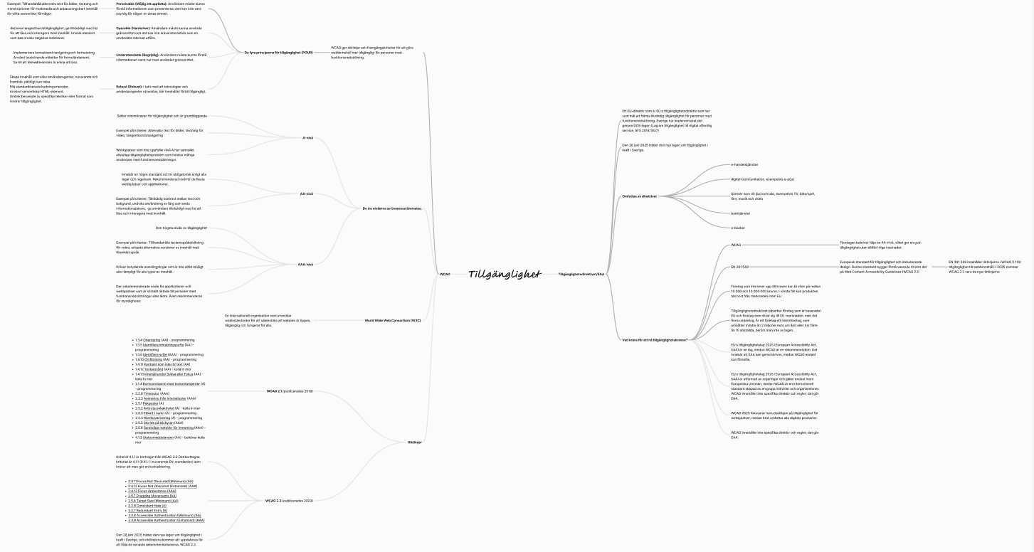
Figure 1: Mind map summarizing WCAG guidelines researched.
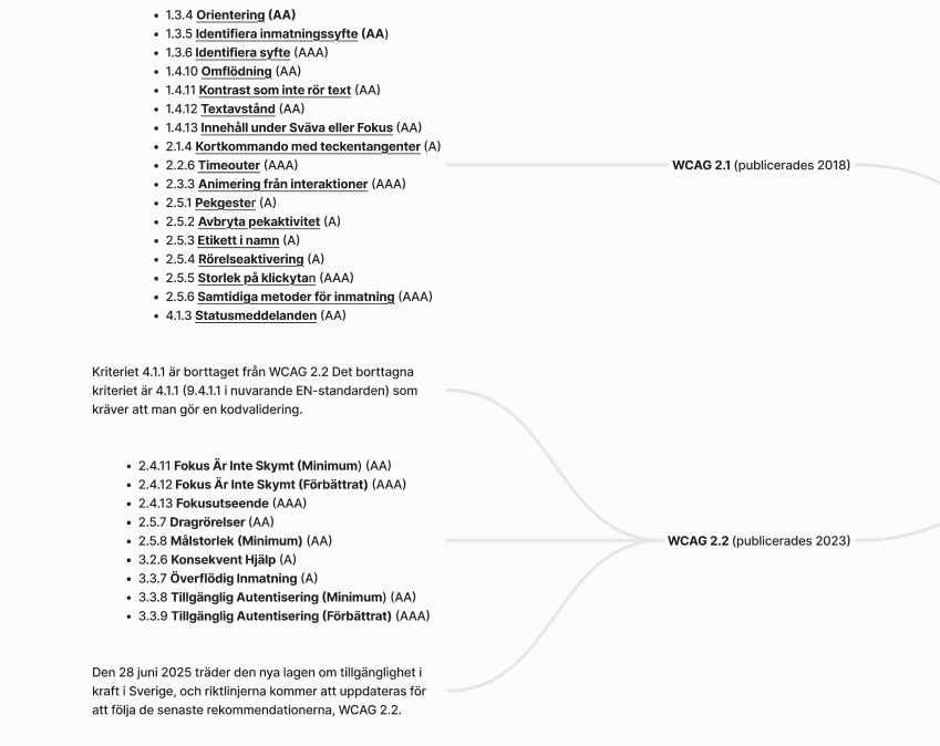
Figure 2: Detailed mind map showing relevant WCAG 2.1/2.2 AA criteria.
- Method: Evaluating WCAG Relevance
- Why: To focus efforts on WCAG criteria most pertinent to the 'Posts' feature.
How: Conceptually applied a color-coding system (Green=Relevant/Compliant, Yellow=Needs Review, Red=Less Relevant/Issue) to the WCAG criteria map (Figure 2). This guided the initial focus towards cognitive accessibility, although user testing later proved more revealing. -
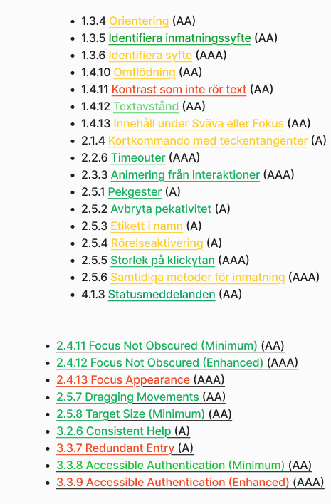
Figure 3: Conceptual color-coding applied to the WCAG mindmap.
- Method: Accessibility Assessment (Automated)
- Why: For a quick initial scan for technical WCAG violations.
How: Used the "Web Accessibility Extension" browser tool on key views against WCAG 2.2 AA. Major findings summarized later. -
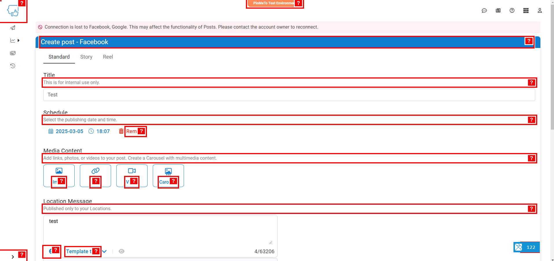
Figure 4: Example: Using the automated assessment tool.
- Method: Competitor Analysis (Accessibility Lens)
- Why: To benchmark against competitors (Yext, Uberall) and common practices.
How: Analyzed public screenshots focusing on potential accessibility pitfalls.
Key Observations:- Low contrast text was prevalent.
- Potentially unlabeled icons impacting screen readers.
- Unclear information hierarchy or dense layouts.
- Uberall's preview pane noted as positive.
Analysis based only on static images provided context.
-
Yext's interface used for analysis.
Uberall's interface used for analysis.
- Method: Client Input (PinMeTo)
- Why: To align with business goals and gather existing user knowledge.
How: Regular meetings; input from Customer Success; reviewed user journey map (Figure 5) highlighting known pain points:- Pain Point: Users confusing 'Location input' with 'Brand Page input'.
- Pain Point: Users finding it difficult to exit the 'Create a Post' view.
-
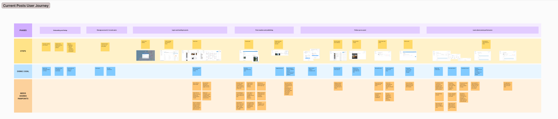
Figure 5: User journey for 'Posts' provided by PinMeTo.
- Method: User Testing (Current Design)
- Why: To uncover real-world usability and cognitive barriers.
How: Moderated think-aloud tests with 3 participants with ADHD (subset of NDD). Each ~35min session involved tasks in the 'Create a Post' view (Figure 6). -
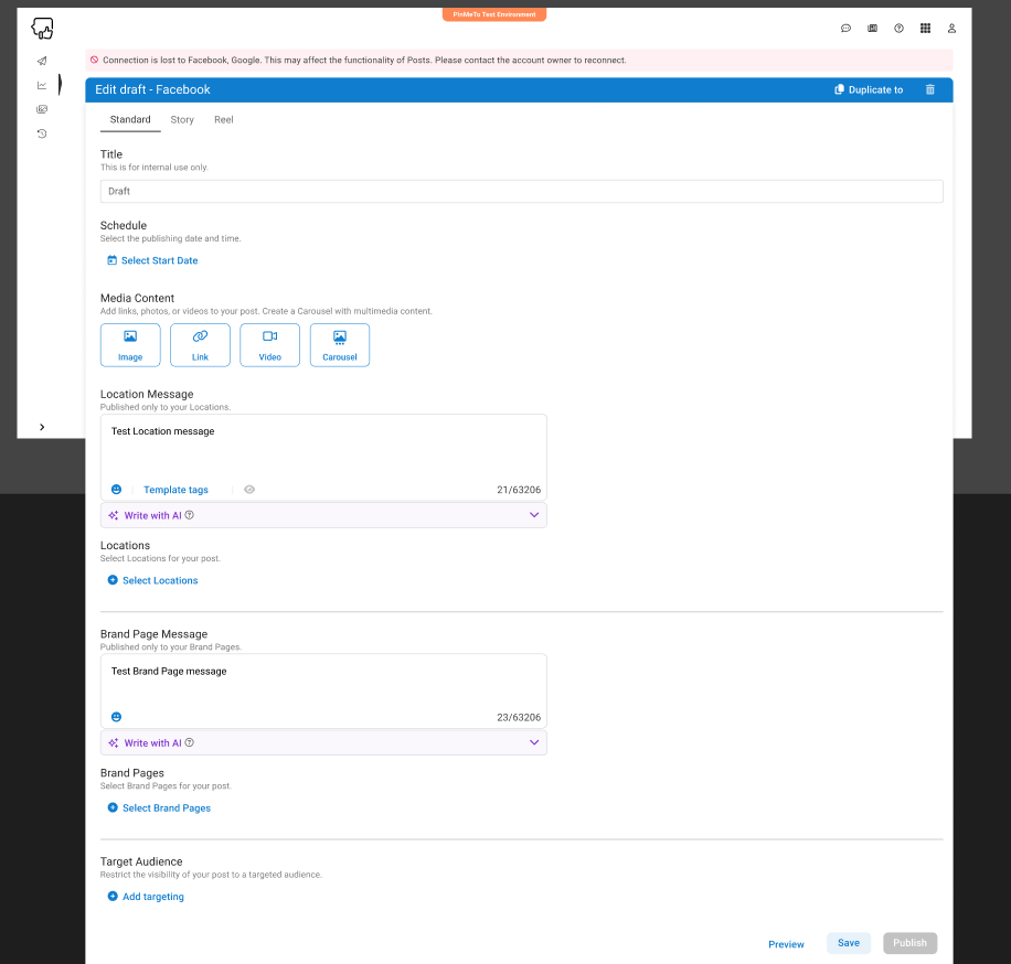
Figure 6: The 'Create a Post' view used during initial user testing.
2. Define: Synthesizing Research & Framing Problems
Data was synthesized using affinity diagramming. Automated assessment highlighted technical WCAG issues, while user testing revealed critical usability and cognitive barriers.
Summary of Findings from Automated WCAG Assessment:
| Category (SC) | Status | Level | Elements |
|---|---|---|---|
| Low Contrast (1.4.3) | Serious | AA | 67 |
| Button Text (4.1.2) | Critical | A | 8 |
| Link Text (2.4.4, 4.1.2) | Serious | A | 7 |
| Zoom/Scale Disabled (1.4.4) | Critical | AA | 3 |
| Image Alt Text (1.1.1) | Critical | A | 1 |
| Link Discernibility (1.4.1) | Serious | A | 1 |
Key Themes from User Testing (NDD Focus) & Client Input:
| Theme | Key Issues Identified |
|---|---|
| Terminology & Understanding | Confusing labels ("Location message"); unclear purpose; lack of guidance; input field mix-ups. |
| Logic & Workflow | Unintuitive order; difficult exit; workflow mismatches mental model. |
| Visual Feedback & Information | No immediate preview; hard-to-find scheduling; text placement uncertainty. |
| Specific Function Issues | "Duplicate" button hard to find/use. |
| Design & Cognition | Desire for dark mode; feeling overwhelmed; contrast issues confirmed. |
User tests emphasized cognitive challenges for users with NDD. "How Might We" (HMW) questions were formulated based on these findings to guide ideation:
- How might we make the terminology in the tool clearer and easier to understand in the "Create Post" view?
- How might we give users more context and information about the different functions in the "Create Post" view?
- How might we reduce the visual strain for users when working with Posts?
- How might we make the flow of functions in the tool more logical and intuitive in the "Create Post" view?
- How might we make the "duplicate draft" function clearer and more usable in the "Create Post" view?
- How might we make it easier for the user to exit the "Create Post" view?
Personas (NDD Focus)
Two personas representing challenges for individuals with NDD (specifically ADHD) guided the design:
Anna - Social Media Manager (ADHD)
- Needs & Challenges: Needs simple, time-saving tools; easily overwhelmed; requires clear terminology & structure; sensitive to bright interfaces.
Erik - Small Business Owner (ADHD)
- Needs & Challenges: Needs quick, easy tools; requires clear instructions; struggles with low contrast; easily distracted by clutter.
3. Ideate & 4. Prototype: Developing Solutions
Using Balsamiq for rapid lo-fi prototyping, two concepts emerged:
- Concept 1 (Progressive Disclosure): Reduced cognitive load by hiding details (Figures 7 & 8).
- Concept 2 (Grouped Sections & Preview): Improved clarity with grouped functions and an immediate preview pane (Figure 9).
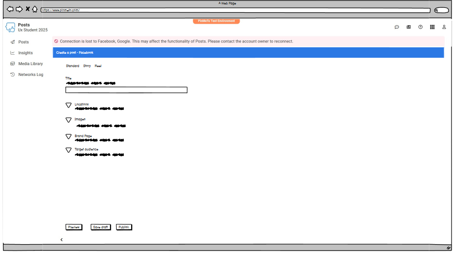
Figure 7: Concept 1 (Lo-fi) - collapsed view.
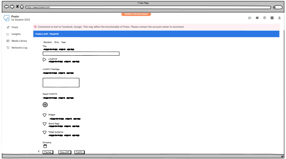
Figure 8: Concept 1 (Lo-fi) - expanded view.
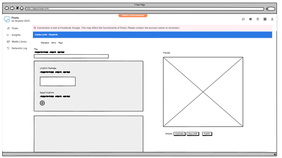
Figure 9: Concept 2 (Lo-fi) - grouped sections and side preview.
Concept 2 was selected for hi-fi prototyping in Figma, as it balanced clarity improvements with less disruption to the existing UI.
5. Test & Iterate: Refining the Design
The interactive hi-fi prototype underwent evaluation via client feedback and a follow-up user test.
Iteration 1 Design Changes (Based on Initial Research)
This iteration implemented solutions addressing the defined problems (Figures 10-12):
- Structure & Clarity: Visually grouped sections; simplified terminology.
- Workflow: Reordered functions; added 'Back' button.
- Feedback & Efficiency: Integrated preview; repositioned buttons.
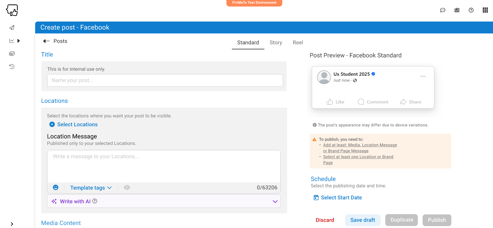
Figure 10: Hi-fi prototype (Iteration 1) showing grouped sections and preview.
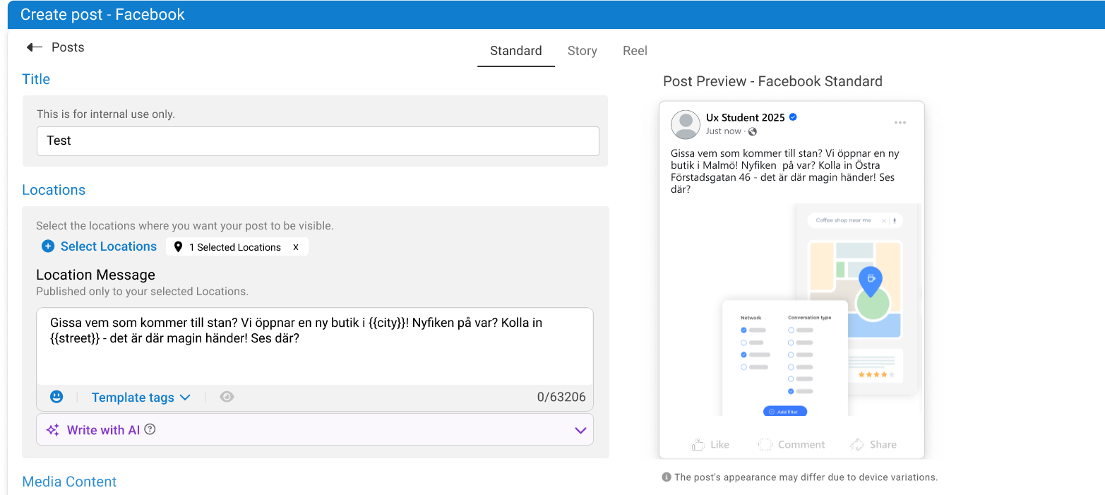
Figure 11: Iteration 1 - Displaying scheduling options.
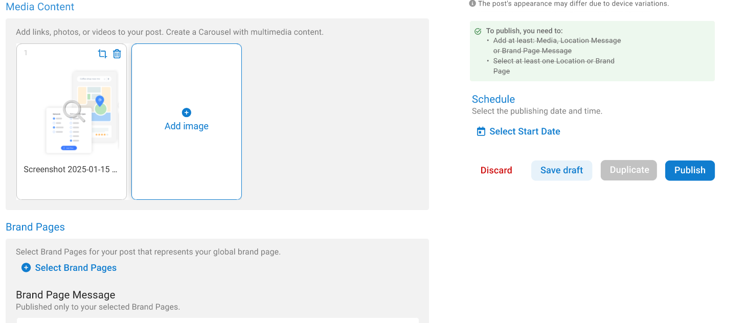
Figure 12: Iteration 1 - Expanded view or different state.
Feedback on Iteration 1
Client and user feedback highlighted refinements:
| Area | Feedback Summary |
|---|---|
| Back Button | Placement could be higher or use breadcrumbs. |
| Rubric Color / Grouping | Blue rubrics conflicted; dark gray suggested. Background boxes potentially inconsistent. |
| Direct Preview | Highly valued. |
| Duplicate Button | Placement questioned. |
| Terminology/Help Text | Further clarification needed; consider hiding help text. |
Iteration 2 Design Changes (Final Proposed Design)
The final iteration incorporated this feedback (Figures 13 & 14):
- Rubric color changed to dark gray.
- Help texts refined/combined.
- 'Back' button moved above title.
- Type buttons reverted (client preference).
- 'Duplicate' button moved near preview, always visible.
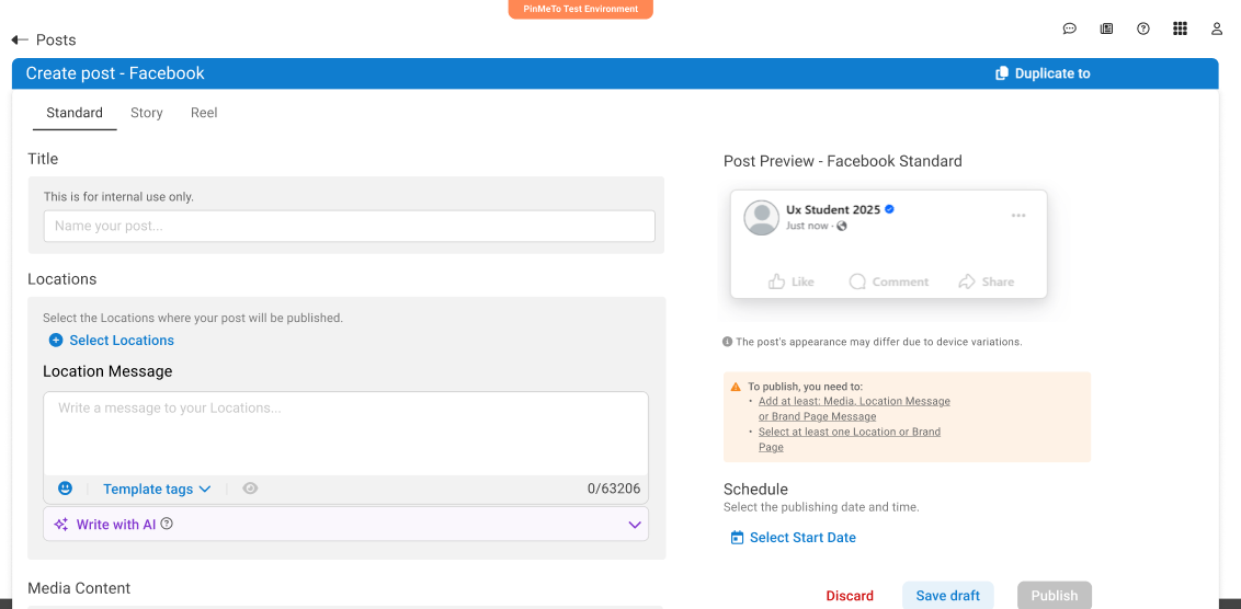
Figure 13: Final prototype design (Iteration 2).
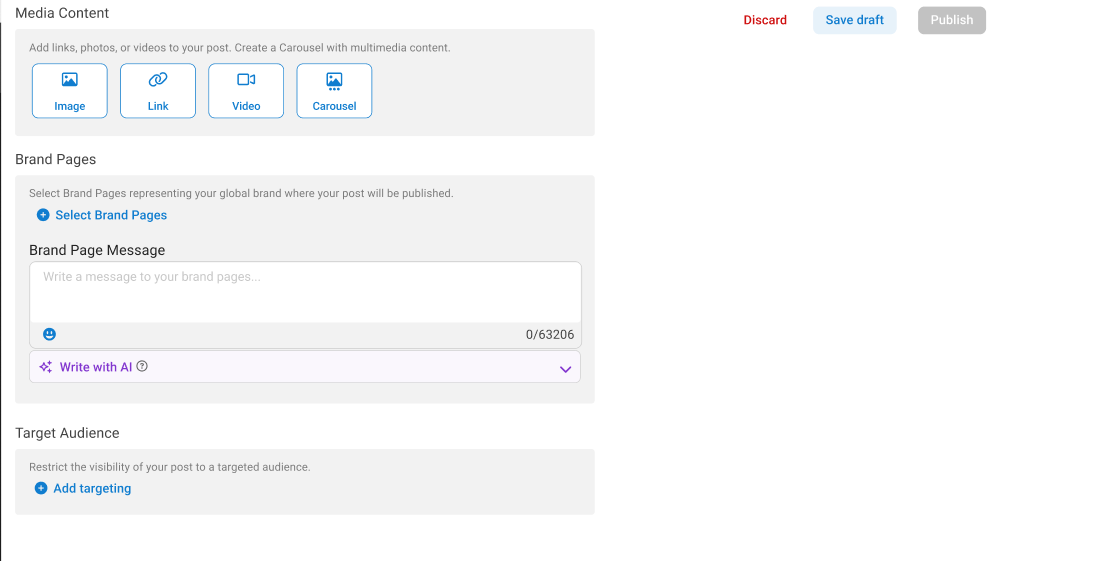
Figure 14: Final prototype design - different state.
Key Design Improvements (Before & After Examples)
The iterative process led to several key improvements focused on addressing the identified usability and cognitive barriers. Here are two examples:
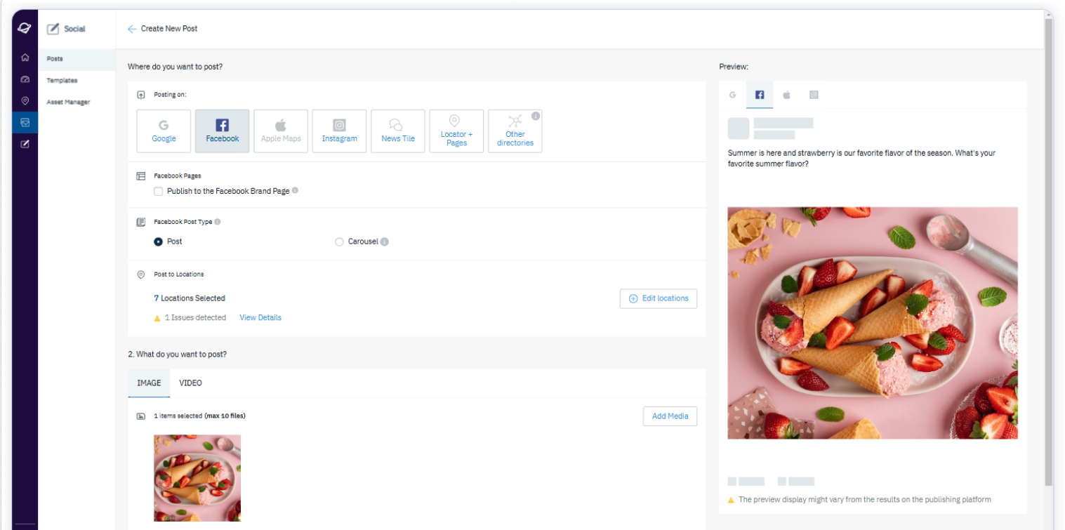
1. Immediate Preview & Reduced Clutter
Problem: User testing revealed uncertainty and required extra steps because users couldn't immediately see how their post would look (see Figure 6). Users with NDD also reported feeling overwhelmed by the amount of information presented at once.
Solution (Iteration 2): Inspired by competitor analysis (Uberall) and direct user feedback, an immediate preview pane was added to the right side. Additionally, related sections ('Locations', 'Brand Pages') were visually grouped, and help texts were combined to reduce clutter and cognitive load (see Figure 13).
Before (Original Interface)
Figure 6: Original view requiring manual preview click, less grouping. Click to zoom.
After (Iteration 2 Design)
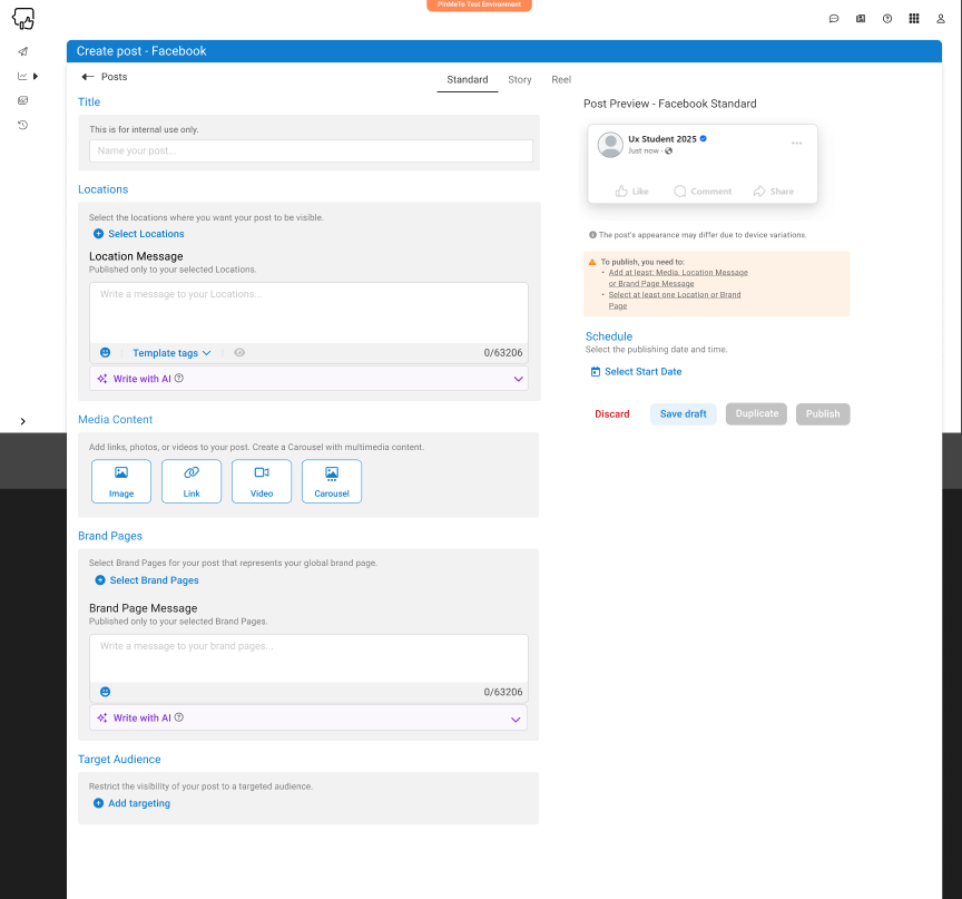
Figure 13: Redesigned view with integrated preview and grouped sections. Click to zoom.
2. Clearer Terminology & Structure
Problem: Users found terms like "Location message" confusing and struggled with the distinction between 'Location' and 'Brand Page' posts. The initial workflow felt illogical.
Solution (Iteration 2): Sections were regrouped under clearer headings ("Locations", "Brand Pages"). Confusing sub-labels like "Location Message" were removed, and help texts were consolidated. The workflow for selecting locations/pages before writing the message was made more explicit in the grouping (compare Figure 6 and Figure 13).
Reflections on WCAG & Testing
A key insight was that while automated tools quickly identified technical WCAG issues, user testing was essential for uncovering critical usability barriers related to cognitive load, unclear terminology, and confusing workflows (often linked to WCAG 1.3.1, 3.3.2).
This highlights that a truly inclusive design process cannot rely solely on automated checks; qualitative testing with diverse users is paramount for validating usability and identifying barriers tools miss.
Due to project scope, testing was limited to users with ADHD. Broader testing with users representing other disabilities would be a valuable next step. Consistent documentation linking design choices to accessibility rationale is also recommended.
Conclusion & Key Learnings
This project provided PinMeTo with actionable insights and a user-tested prototype demonstrating improvements to the 'Posts' feature, focusing on enhanced clarity, workflow, and cognitive accessibility based on WCAG principles and NDD user feedback. It underscored the business case for inclusive design (enhanced UX, compliance, brand reputation).
Successfully integrating accessibility requires a proactive, iterative approach involving continuous learning, early consideration in design, and regular testing with users representing diverse abilities.
Personal Learnings for Future Application:
- Combine Automated & Manual Testing: Recognize limitations of automated tools; always supplement with qualitative user testing for a holistic accessibility view.
- Advocate for Cognitive Accessibility: Address cognitive load, clarity, and intuitive flows, not just technical compliance.
- Document Accessibility Decisions: Document the 'why' behind accessibility choices for handoffs and consistency.
- Iterate Based on Diverse Feedback: Value iterating based on both user and stakeholder feedback.
Applying these learnings fosters a more robust and inclusive design process.